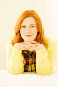
The cover reveals continue this week as I welcome an author and woman I greatly admire, Lindsay Eagar, to Pop! Goes The Reader as we reveal the cover of Lindsay’s forthcoming middle grade novel, The Bigfoot Files! Lindsay is no stranger to the blog, having generously lent her voice to several events on Pop! Goes The Reader in the past, including ‘Tis The Season: Authors Talk Holidays 2015, Her Story: Ladies In Literature 2016 and ‘Tis The Season: Authors Talk Holidays 2016, so I couldn’t have been more excited when she reached out and I was given an opportunity to work with her again! Coming to a bookstore and library near you October 9, 2018 from Candlewick, The Bigfoot Files tells the story of twelve-year-old Miranda Cho, the daughter of a cryptozoologist who attempts to disabuse her mother of her belief in Bigfoot, the Loch Ness Monster, the Frogman, and the like in order to ensure the pair have a practical, safe and secure future. As an extra special bonus, Lindsay recently spoke with The Bigfoot Files‘s cover designer, Matt Roeser, for an interview that provides a fascinating glimpse into Matt’s artistic process and cover design as a whole! I absolutely loved learning how this and other covers came to be, and I can only hope you will, too!

About Lindsay Eagar
Lindsay Eagar is a good mom on bad writing days and a bad mom on good writing days. She lives in Utah with her husband, her two daughters, and a mountain of books.

So much attention is given to authors and our work — the ideas that spark whole stories, the drafting process, the woes of revision, and the triumph of a finished manuscript.
But what about the countless others in this industry who take a chunk of words and make it into a tangible, holdable, huggable book? We hear about them so rarely, and yet they are our heroes — cover designers, in particular, are responsible for presenting our potential readers with a single image that sums up our book and entices them to buy.
I have been lucky enough to land the incomparable Matt Roeser for all three of my books with Candlewick Press. This man wins awards for his designs. His style is instantly recognizable — subtle, focused, somehow simplistic while being absolutely original. He also plays with color in a way that feels very timeless.
All three of my covers have, so far, taken my breath away and also felt like the perfect story ending — surprising, beautiful, and inevitable, but that’s the Matt Roeser way. (The Matt Roeser way is also to wake up on a random Tuesday and decide, “Yes, today I think I’ll wear the inflatable T-Rex costume to work.”)
Matt was kind enough to let me pick his brain with a few questions:
Question 1.
What is the very first thing you do when you are assigned a book to create a cover for? Talk me through all the creative steps. Is there a part of the process that is ever hindered by the fact that you are designing this to be a product?
First, I read the book. Within the text of the manuscript is the kernel of what the cover will become. Reading the book is the only way to get the feel for its voice and its tone; what it wants to be. As I’m reading, I take notes on particular scenes, lines, and ideas that come to mind. Then I meet with the editor to hear their thoughts on how they’d like to position the book. I then go play. This involves sketching, googling, and lots of concepting, from big idea stuff down to the specifics of particular typefaces. From the myriad concepts I come up with, I whittle it down to 3 or so that I discuss with my Creative Director. From there, we share it with representatives of different departments in the company and make adjustments until we all love it.
I actually come from an advertising background. At my previous job, we would rebrand companies and then roll out that messaging and new look across all of their communications. So in a sense, the fact that the book is the main end product designing a cover makes it, in my eyes, a much simpler task. I have to show the essence of the book on the cover and make it enticing for someone to pick up.
Question 2.
You read the book first when you are assigned to design its cover, and obviously you’re reading FOR specific elements that you can capture in the design, but how does that affect the way you read all books? Do you have a hard time turning off your design brain?
I tend to gravitate toward books that have nice covers. Unless a book has great reviews or a friend has told me I HAVE to read it, if a book has a bad cover, I will probably pass it by. Because of that, most of the time when I’m reading for fun, it’s a bit easier to turn off my design brain. However, every once in a while when I finish a book, I wonder about possible other designs for the story. I actually got my start in cover design by designing new covers for some of my favorite books for fun, posting them on a tumblr blog that got passed around some design sites and eventually led to real-world work.
Question 3.
When you got a copy of The Bigfoot Files, what were some of the elements of the book that you wanted to capture in the cover?
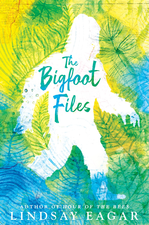
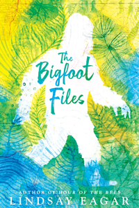
Foremost, because of the title and the focus that the idea of Bigfoot plays in the book, I knew there was going to be some representation of the mythic creature on the cover. Because the main heart of the story is about what’s true and what’s not, I knew I wanted to play with the possibility that either character could be correct. The solution was the classic silhouette of Bigfoot but made in the negative space between the leaves of the national park forest (where a majority of the book is set), so he’s sort of there but also looks like he could disappear into the leaves if you looked away for a second.
Question 4.
What are the same aesthetics you keep coming back to, both as a designer and as just a human? What is something you will always stop and take a picture of, every time?
I’m a fan of typography that works effortlessly into a design. Or any design that makes you look twice or stop and think. Also designs that do something different or unexpected that package the book in a way that makes you NEED to have it.
Question 5.
You haven’t been working in the book industry for decades, but you have been here awhile — what’s different about book design and packaging and production now versus when you started? Is there a particular trend you miss? Or want to go away?
I’ll always prefer a more graphic design approach over a photographic cover any day, so even though photographic covers are not a trend, I would love to do an experiment where all of publishing tries to go a year without using text over a photograph. I would rather save photographs for the movie poster of the book. As for trends, I try to collect all of the printing effects, and one that I haven’t gotten to use yet is glow in the dark ink, so that’s definitely on my list. The jacket design by Rodrigo Corral for Mr. Penumbra’s 24-Hour Bookstore is the best use of glow in the dark ink ever used, so I feel like I can only use it if it’s as good as an idea as that.
Question 6.
You also write books, which some would say is creative work. Do you feel like there’s a relationship between your two mediums? How do they feed each other/take away from each other?
I’m a big fan of stories, and I like to think that whether it’s writing a book or designing a cover, I’m telling a bit of a story. Obviously with a book, you have pages and pages to tell a story, and the expectations are that there will be a beginning, middle and end. With a cover design, you just get a moment to hint at the story, but in a way, it’s finding that spark that will catch a reader’s eye and make them want to pick up the book. From there, they can read the flaps and see if the book sounds interesting to them, but if I can excite them for just a moment, that’s equally as rewarding as telling a good story.
Question 7.
Do you have any wisdom to impart to us authors who are always panicking about what our covers will look like? (Side note: never me; I am in good hands and I know it!)
Design is so subjective, so what one person finds appealing might be unappealing to someone else, so it’s natural for an author to worry about what their book (that they’ve spent years writing and visualizing) is going to look like. But just as writers know how to write, and editors know how to edit, designers know what will best showcase an author’s story to the world. The design is also presented to other departments who are all pros in their area, who make sure the book is the best it can be. For example, when I have some concepts, I go talk to the Production department. They’re responsible for getting the book physically made (working with the printing press, choosing papers, finishes, effects, etc.) and they will often make suggestions of how to take a design and improve it by using certain printing effects. Everyone’s goal is to make every book the best book.
Question 8.
What are you reading right now? What did you just finish that you loved? What are you going to read next?
I’m currently reading The Witches of New York by Ami McKay, which combines many of the things I love: old timey New York city, magic, and great characters. Up next is All The Light We Cannot See by Anthony Doerr, because I’ve been dying to read it forever. I love nonfiction as well, and just finished Explorers’ Sketchbooks: The Art of Discovery & Adventure which was beautiful and inspiring and makes me want to go on an expedition.
● ● ● ● ● ● ● ● ● ● ● ●
Thank you so much to Matt, for answering my questions, and for designing the most perfect cover for my next middle grade. Seriously, it takes an extremely talented designer to read a book that is about mothers and daughters, cryptozoology, a national forest in Washington, magic, and heartbreak, and somehow combine that into one image that captures it all.
Here’s where you can find Matt online for pretty designs and pop culture hilarity:
Website ● Twitter


Title The Bigfoot Files
Author Lindsay Eagar
Pages 384 Pages
Intended Target Audience Middle Grade
Genre Contemporary, Light Fantasy
To Be Published October 9, 2018 by Candlewick
Find It On Goodreads ● Amazon.com ● Chapters ● The Book Depository
Twelve-year-old Miranda Cho used to love being the daughter of a cryptozoologist, tagging along on monster hunts and gasping over every footprint, every bit of evidence that Bigfoot, or the Loch Ness Monster, or the Frogman was hiding just around the corner. But that was before Miranda found the stack of unopened bills and the notice of foreclosure in the silverware drawer. Now her mom’s job doesn’t seem wonderful — it seems embarrassing and dangerously irresponsible. So Miranda agrees to go on one last creature hunt, determined to use all her scientific know-how to prove to her mother that Bigfoot doesn’t exist. Then her mom will have no choice but to grow up and get a real job, one that will pay the mortgage and allow Miranda to attend the leadership camp of her dreams. But when the trip goes horribly awry, will it be Miranda who is forced to question everything she believes?
From the author of Hour of the Bees comes another unforgettable story that deftly blurs the line between reality and magic — and will leave you wondering What if?